首页 > Python基础教程 > Python数据可视化
阅读:4,439
Python读取JSON文件
教程前面章节曾介绍过 JSON 格式的数据,这种格式的数据通常会被转换为 Python 的 list 列表或 dict 字典。本节展示的是世界各国历年 GDP 总和,数据来源于 https://datahub.io 网站。数据格式如下:
使用 Python 的 json 模块读取 JSON 数据非常简单,只要使用 load() 函数加载 JSON 数据即可。下面程序示范了读取 2016 年中国的 GDP 值:
运行上面程序,可以看到如下输出结果:
下面程序将会使用 Matplotlib 生成柱状图来展示这 5 个国家的 GDP 数据:
但由于 Matplotlib 要求被展示数据是 list 列表,因此上面程序中的第 26、28 两行代码使用循环依次读取从 2001 年到 2016 年的 GDP 数据,并将这些数据添加到 country_gdp_list 列表的元素中。这样就把 dict 形式的 GDP 数据转换成 list 形式的 GDP 数据。
上面程序中的第 35、37 两行代码采用循环添加了 5 组柱状图,接下来程序还在中国、美国的条柱上绘制了 GDP 值。
运行上面程序,可以看到如图 1 所示的柱状图。
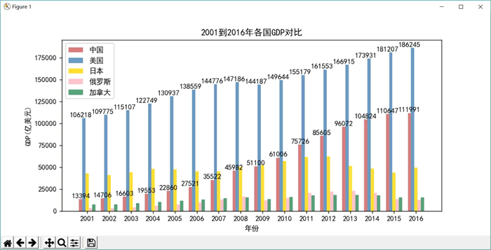
图 1 从 2001 年到 2016 年各国GDP 对比柱状图
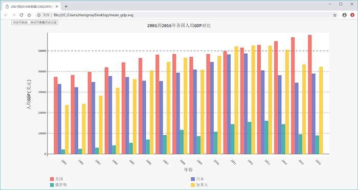
如果通过 https://datahub.io 网站下载了世界各国人口数据,就可以计算出以上各国的人均 GDP。下面程序会使用 Pygal 来展示世界各国的人均 GDP 数据。
此程序的后半部分代码创建了 pygal.Bar 对象,并使用循环为该对象添加了各国人均 GDP 数据,这样该柱状图就可以展示各国的人均 GDP 值。
运行上面程序,可以看到如图 2 所示的柱状图。
[{"Country Code":"ARB","Country Name":"Arab World",
"Value":25760683041.0857,"Year":1968},
{"Country Code:"ARB", "country Name":"Arab World",
"Value":28434203615.4829, "Year":1969},
...
]
使用 Python 的 json 模块读取 JSON 数据非常简单,只要使用 load() 函数加载 JSON 数据即可。下面程序示范了读取 2016 年中国的 GDP 值:
import json

filename = 'gdp_json.json'

with open(filename) as f:
    gpd_list = json.load(f)
# 遍历列表的每个元素,每个元素是一个GDP数据项
for gpd_dict in gpd_list:
    # 只显示中国、2016年的GDP
    if gpd_dict['Year'] == 2016 and gpd_dict['Country Code'] == 'CHN':
        print(gpd_dict['Country Name'], gpd_dict['Value'])
上面程序中,第 6 行代码调用 json 模块的 load() 函数加载 JSON 数据,该函数将会返回一个 list 列表,接下来程序遍历该 list 列表即可访问到指定年份、指定国家的 GDP 值。运行上面程序,可以看到如下输出结果:
China 11199145157649.2
在掌握了使用 json 模块读取这份 JSON 数据的方法之后,接下来我们将会从中读取从 2001 年到 2016 年中国、美国、日本、俄罗斯、加拿大这 5 个国家的 GDP 数据,并使用柱状图进行对比。下面程序将会使用 Matplotlib 生成柱状图来展示这 5 个国家的 GDP 数据:
import json
from matplotlib import pyplot as plt
import numpy as np

filename = 'gdp_json.json'
# 读取JSON格式的GDP数据
with open(filename) as f:
    gpd_list = json.load(f)
# 使用list列表依次保存中国、美国、日本、俄罗斯、加拿大的GDP值
country_gdps = [{}, {}, {}, {}, {}]
country_codes = ['CHN', 'USA', 'JPN', 'RUS', 'CAN']
# 遍历列表的每个元素,每个元素是一个GDP数据项
for gpd_dict in gpd_list:
    for i, country_code in enumerate(country_codes):
        # 只读取指定国家的数据
        if gpd_dict['Country Code'] == country_code:
            year = gpd_dict['Year']
            # 只读取2001年到2016
            if 2017 > year > 2000:
                country_gdps[i][year] = gpd_dict['Value']
# 使用list列表依次保存中国、美国、日本、俄罗斯、加拿大的GDP值
country_gdp_list = [[], [], [], [], []]
# 构建时间数据
x_data = range(2001, 2017)
for i in range(len(country_gdp_list)):
    for year in x_data:
        # 除以1e8,让数值变成以亿为单位
        country_gdp_list[i].append(country_gdps[i][year] / 1e8)
bar_width=0.15
fig = plt.figure(dpi=128, figsize=(15, 8))
colors = ['indianred', 'steelblue', 'gold', 'lightpink', 'seagreen']
# 定义国家名称列表
countries = ['中国', '美国', '日本', '俄罗斯', '加拿大']
# 采用循环绘制5组柱状图
for i in range(len(colors)):
    # 使用自定义X坐标将数据分开
    plt.bar(x=np.arange(len(x_data))+bar_width*i, height=country_gdp_list[i],
        label=countries[i], color=colors[i], alpha=0.8, width=bar_width)
    # 仅为中国、美国的条柱上绘制GDP数值
    if i < 2:
        for x, y in enumerate(country_gdp_list[i]):
            plt.text(x, y + 100, '%.0f' % y, ha='center', va='bottom')
# 为X轴设置刻度值
plt.xticks(np.arange(len(x_data))+bar_width*2, x_data)
# 设置标题
plt.title("2001到2016年各国GDP对比")
# 为两条坐标轴设置名称
plt.xlabel("年份")
plt.ylabel("GDP(亿美元)")
# 显示图例
plt.legend()
plt.show()
本程序的重点其实在于前半部分代码,这部分代码控制程序从 JSON 数据中只读取中国、美国、日本、俄罗斯、加拿大这 5 个国家的数据,且只读取从 2001 年到 2016 年的 GDP 数据,因此程序处理起来稍微有点麻烦(程序先以年份为 key 的 dict(如程序中 country_gdps 列表的元素所示)来保存各国的 GDP 数据。但由于 Matplotlib 要求被展示数据是 list 列表,因此上面程序中的第 26、28 两行代码使用循环依次读取从 2001 年到 2016 年的 GDP 数据,并将这些数据添加到 country_gdp_list 列表的元素中。这样就把 dict 形式的 GDP 数据转换成 list 形式的 GDP 数据。
上面程序中的第 35、37 两行代码采用循环添加了 5 组柱状图,接下来程序还在中国、美国的条柱上绘制了 GDP 值。
运行上面程序,可以看到如图 1 所示的柱状图。
图 1 从 2001 年到 2016 年各国GDP 对比柱状图
如果通过 https://datahub.io 网站下载了世界各国人口数据,就可以计算出以上各国的人均 GDP。下面程序会使用 Pygal 来展示世界各国的人均 GDP 数据。
import json
import pygal

filename = 'gdp_json.json'
# 读取JSON格式的GDP数据
with open(filename) as f:
    gpd_list = json.load(f)
pop_filename = 'population-figures-by-country.json'
# 读取JSON格式的人口数据
with open(pop_filename) as f:
    pop_list = json.load(f)

# 使用list列表依次保存美国、日本、俄罗斯、加拿大的人均GDP值
country_mean_gdps = [{}, {}, {}, {}]
country_codes = ['USA', 'JPN', 'RUS', 'CAN']
# 遍历列表的每个元素,每个元素是一个GDP数据项
for gpd_dict in gpd_list:
    for i, country_code in enumerate(country_codes):
        # 只读取指定国家的数据
        if gpd_dict['Country Code'] == country_code:
            year = gpd_dict['Year']
            # 只读取2001年到2016
            if 2017 > year > 2000:
                for pop_dict in pop_list:
                    # 获取指定国家的人口数据
                    if pop_dict['Country_Code'] == country_code:
                        # 使用该国GDP总值除以人口数量,得到人均GDP
                        country_mean_gdps[i][year] = round(gpd_dict['Value']
                            / pop_dict['Population_in_%d' % year])
# 使用list列表依次保存美国、日本、俄罗斯、加拿大的人均GDP值
country_mean_gdp_list = [[], [], [], []]
# 构建时间数据
x_data = range(2001, 2017)
for i in range(len(country_mean_gdp_list)):
    for year in x_data:
        country_mean_gdp_list[i].append(country_mean_gdps[i][year])
# 定义国家名称列表
countries = ['美国', '日本', '俄罗斯', '加拿大']
# 创建pygal.Bar对象(柱状图)
bar = pygal.Bar()
# 采用循环添加代表条柱的数据
for i in range(len(countries)):
    bar.add(countries[i], country_mean_gdp_list[i])
bar.width=1100
# 设置X轴的刻度值
bar.x_labels = x_data
bar.title = '2001到2016年各国人均GDP对比'
# 设置X、Y轴的标题
bar.x_title = '年份'
bar.y_title = '人均GDP(美元)'
# 设置X轴的刻度值旋转45度
bar.x_label_rotation = 45
# 设置将图例放在底部
bar.legend_at_bottom = True
# 指定将数据图输出到SVG文件中
bar.render_to_file('mean_gdp.svg')
上面程序中,第 11 行代码加载了一份新的关于人口数据的 JSON 文件,这样程序即可通过该文件获取世界各国历史的人口数据。第 28 行代码使用 GDP 总值除以该国的人口数量,这样就可以得到该国的人均 GDP。此程序的后半部分代码创建了 pygal.Bar 对象,并使用循环为该对象添加了各国人均 GDP 数据,这样该柱状图就可以展示各国的人均 GDP 值。
运行上面程序,可以看到如图 2 所示的柱状图。
所有教程
- socket
- Python基础教程
- C#教程
- MySQL函数
- MySQL
- C语言入门
- C语言专题
- C语言编译器
- C语言编程实例
- GCC编译器
- 数据结构
- C语言项目案例
- C++教程
- OpenCV
- Qt教程
- Unity 3D教程
- UE4
- STL
- Redis
- Android教程
- JavaScript
- PHP
- Mybatis
- Spring Cloud
- Maven
- vi命令
- Spring Boot
- Spring MVC
- Hibernate
- Linux
- Linux命令
- Shell脚本
- Java教程
- 设计模式
- Spring
- Servlet
- Struts2
- Java Swing
- JSP教程
- CSS教程
- TensorFlow
- 区块链
- Go语言教程
- Docker
- 编程笔记
- 资源下载
- 关于我们
- 汇编语言
- 大数据
- 云计算
- VIP视频