Flutter widget index
This is an alphabetical list of nearly every widget that is bundled with Flutter. You can also browse widgets by category.
You might also want to check out our Widget of the Week video series on the Flutter YouTube channel. Each short episode features a different Flutter widget. For more video series, see our videos page.
A widget that absorbs pointers during hit testing. When absorbing is true, this widget prevents its subtree from receiving pointer events by terminating hit testing at itself. It still consumes space during layout and paints its child as usual. It just prevents its children from being the target of located events, because it returns true from RenderBox.hitTest.
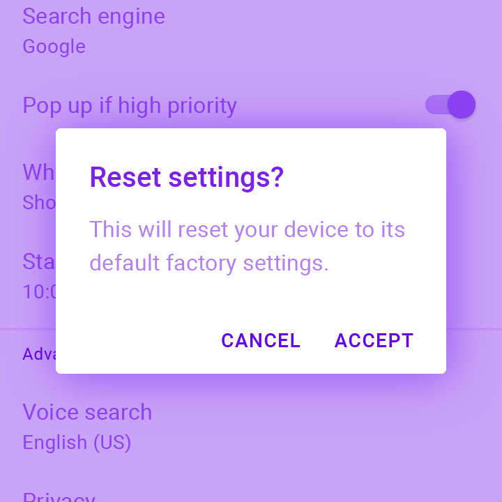
Alerts are urgent interruptions requiring acknowledgement that inform the user about a situation. The AlertDialog widget implements this component.
A widget that aligns its child within itself and optionally sizes itself based on the child's size.
A general-purpose widget for building animations. AnimatedBuilder is useful for more complex widgets that wish to include an animation as part of a larger build function. To use AnimatedBuilder, simply construct the widget and pass it a builder function.
A container that gradually changes its values over a period of time.
A widget that cross-fades between two given children and animates itself between their sizes.
Animated version of DefaultTextStyle which automatically transitions the default text style (the text style to apply to descendant Text widgets without explicit style) over a given duration whenever the given style changes.
The state for a scrolling container that animates items when they are inserted or removed.
A widget that prevents the user from interacting with widgets behind itself.
Animated version of Opacity which automatically transitions the child's opacity over a given duration whenever the given opacity changes.
Animated version of PhysicalModel.
Animated version of Positioned which automatically transitions the child's position over a given duration whenever the given position changes.
Animated widget that automatically transitions its size over a given duration whenever the given child's size changes.
A widget that rebuilds when the given Listenable changes value.
A base class for widgets with implicit animations.
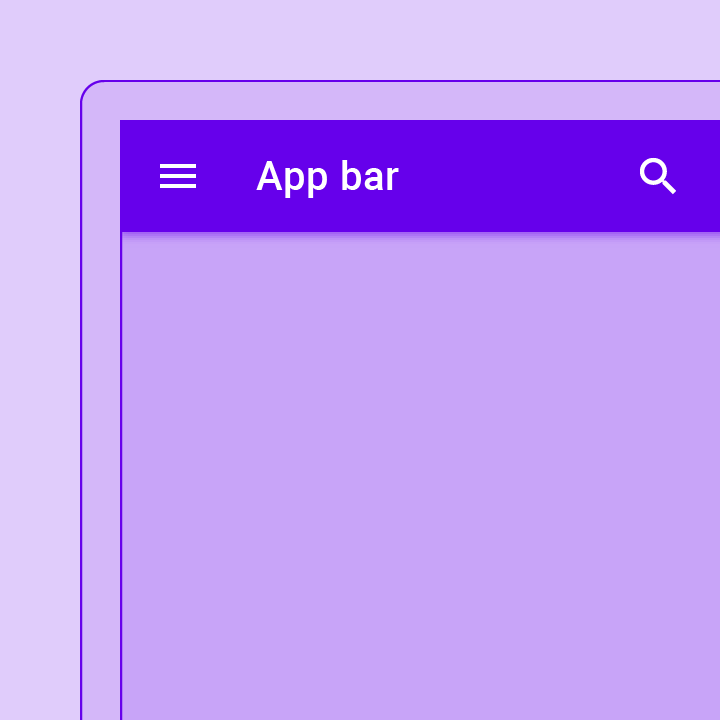
A Material Design app bar. An app bar consists of a toolbar and potentially other widgets, such as a TabBar and a FlexibleSpaceBar.
A widget that attempts to size the child to a specific aspect ratio.
Asset bundles contain resources, such as images and strings, that can be used by an application. Access to these resources is asynchronous so that they can be transparently loaded over a network (e.g., from a NetworkAssetBundle) or from the local file system without blocking the application's user interface.
A widget that applies a filter to the existing painted content and then paints child. This effect is relatively expensive, especially if the filter is non-local, such as a blur.
A widget that positions its child according to the child's baseline.
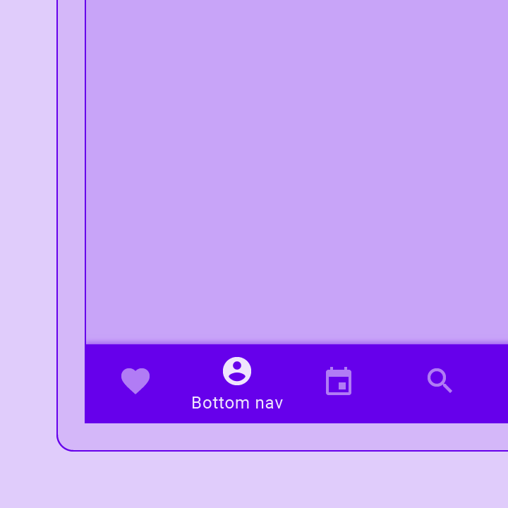
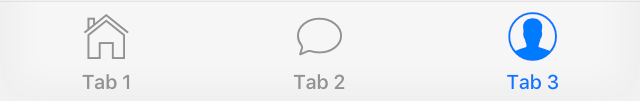
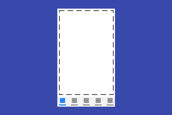
Bottom navigation bars make it easy to explore and switch between top-level views in a single tap. The BottomNavigationBar widget implements this component.
Bottom sheets slide up from the bottom of the screen to reveal more content. You can call showBottomSheet() to implement a persistent bottom sheet or showModalBottomSheet() to implement a modal bottom sheet.
A horizontal arrangement of buttons.
A Material Design card. A card has slightly rounded corners and a shadow.
A widget that centers its child within itself.
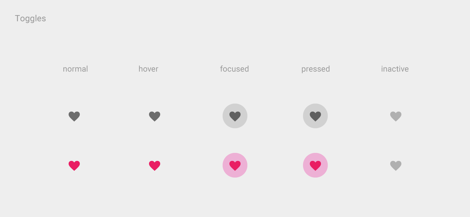
Checkboxes allow the user to select multiple options from a set. The Checkbox widget implements this component.
A Material Design chip. Chips represent complex entities in small blocks, such as a contact.
A material design circular progress indicator, which spins to indicate that the application is busy.
A widget that clips its child using an oval.
A widget that clips its child using a path.
A widget that clips its child using a rectangle.
Layout a list of child widgets in the vertical direction.
A widget that imposes additional constraints on its child.
A convenience widget that combines common painting, positioning, and sizing widgets.
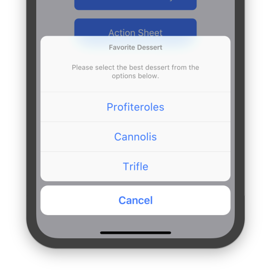
An iOS-style modal bottom action sheet to choose an option among many.
An iOS-style activity indicator. Displays a circular 'spinner'.
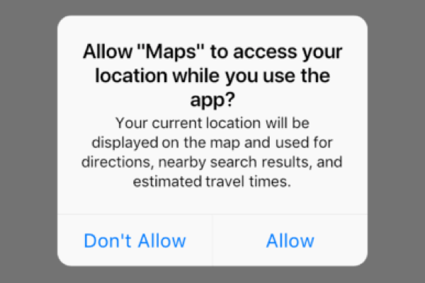
An iOS-style alert dialog.
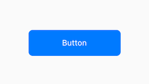
An iOS-style button.
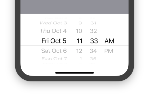
An iOS-style date or date and time picker.
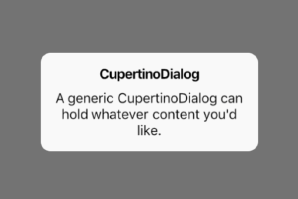
An iOS-style dialog.
A button typically used in a CupertinoAlertDialog.
An iOS-style transition used for summoning fullscreen dialogs.
An iOS-style top navigation bar. Typically used with CupertinoPageScaffold.
Basic iOS style page layout structure. Positions a navigation bar and content on a background.
Provides an iOS-style page transition animation.
An iOS-style picker control. Used to select an item in a short list.
Rounded rectangle surface that looks like an iOS popup surface, such as an alert dialog or action sheet.
An iOS-style scrollbar that indicates which portion of a scrollable widget is currently visible.
An iOS-style segmented control. Used to select mutually exclusive options in a horizontal list.
Used to select from a range of values.
An iOS-style switch. Used to toggle the on/off state of a single setting.
An iOS-style bottom tab bar. Typically used with CupertinoTabScaffold.
Tabbed iOS app structure. Positions a tab bar on top of tabs of content.
Root content of a tab that supports parallel navigation between tabs. Typically used with CupertinoTabScaffold.
An iOS-style text field.
An iOS-style countdown timer picker.
A widget that uses a delegate to size and position multiple children.
A widget that provides a canvas on which to draw during the paint phase.
A ScrollView that creates custom scroll effects using slivers.
A widget that defers the layout of its single child to a delegate.
Data tables display sets of raw data. They usually appear in desktop enterprise products. The DataTable widget implements this component.

Date pickers use a dialog window to select a single date on mobile. Time pickers use a dialog to select a single time (in the hours:minutes format) on mobile.
A widget that paints a Decoration either before or after its child paints.
Animated version of a DecoratedBox that animates the different properties of its Decoration.
The text style to apply to descendant Text widgets without explicit style.
A widget that can be dismissed by dragging in the indicated direction. Dragging or flinging this widget in the DismissDirection causes the child to slide out of view. Following the slide animation, if resizeDuration is non-null, the Dismissible widget animates its height (or width, whichever is perpendicular to the dismiss direction) to zero over the resizeDuration.
A one logical pixel thick horizontal line, with padding on either side.
A widget that receives data when a Draggable widget is dropped. When a draggable is dragged on top of a drag target, the drag target is asked whether it will accept the data the draggable is carrying. If the user does drop the draggable on top of the drag target (and the drag target has indicated that it will accept the draggable's data), then the drag target is asked to accept the draggable's data.
A widget that can be dragged from to a DragTarget. When a draggable widget recognizes the start of a drag gesture, it displays a feedback widget that tracks the user's finger across the screen. If the user lifts their finger while on top of a DragTarget, that target is given the opportunity to accept the data carried by the draggable.
A Material Design panel that slides in horizontally from the edge of a Scaffold to show navigation links in an application.
Shows the currently selected item and an arrow that opens a menu for selecting another item.
A widget that drops all the semantics of its descendants. This can be used to hide subwidgets that would otherwise be reported but that would only be confusing. For example, the Material Components Chip widget hides the avatar since it is redundant with the chip label.
A widget that expands a child of a Row, Column, or Flex.

Expansion panels contain creation flows and allow lightweight editing of an element. The ExpansionPanel widget implements this component.
Animates the opacity of a widget.
Scales and positions its child within itself according to fit.
A flat button is a section printed on a Material Components widget that reacts to touches by filling with color.
A floating action button is a circular icon button that hovers over content to promote a primary action in the application. Floating action buttons are most commonly used in the Scaffold.floatingActionButton field.
A widget that implements the flow layout algorithm.
The Flutter logo, in widget form. This widget respects the IconTheme.
An optional container for grouping together multiple form field widgets (e.g. TextField widgets).
A single form field. This widget maintains the current state of the form field, so that updates and validation errors are visually reflected in the UI.
A widget that applies a translation expressed as a fraction of the box's size before painting its child.
A widget that sizes its child to a fraction of the total available space. For more details about the layout algorithm, see RenderFractionallySizedOverflowBox.
Widget that builds itself based on the latest snapshot of interaction with a Future.
A widget that detects gestures. Attempts to recognize gestures that correspond to its non-null callbacks. If this widget has a child, it defers to that child for its sizing behavior. If it does not have a child, it grows to fit the parent instead.

A grid list consists of a repeated pattern of cells arrayed in a vertical and horizontal layout. The GridView widget implements this component.
A widget that marks its child as being a candidate for hero animations.
A Material Design icon.
An icon button is a picture printed on a Material widget that reacts to touches by filling with color (ink).
A widget that is invisible during hit testing. When ignoring is true, this widget (and its subtree) is invisible to hit testing. It still consumes space during layout and paints its child as usual. It just cannot be the target of located events, because it returns false from RenderBox.hitTest.
A widget that displays an image.
A Stack that shows a single child from a list of children.
A widget that sizes its child to the child's intrinsic height.
A widget that sizes its child to the child's intrinsic width.
Builds a widget tree that can depend on the parent widget's size.
A box that limits its size only when it's unconstrained.
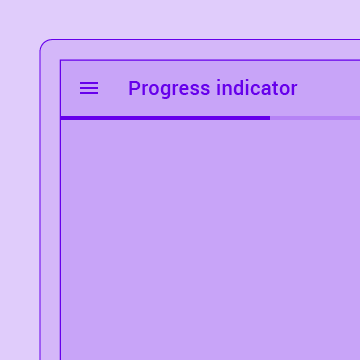
A material design linear progress indicator, also known as a progress bar.
A widget that arranges its children sequentially along a given axis, forcing them to the dimension of the parent in the other axis.
A single fixed-height row that typically contains some text as well as a leading or trailing icon.
A scrollable, linear list of widgets. ListView is the most commonly used scrolling widget. It displays its children one after another in the scroll direction. In the cross axis, the children are required to fill the ListView.
Makes its child draggable starting from long press.
A convenience widget that wraps a number of widgets that are commonly required for applications implementing Material Design.
Establishes a subtree in which media queries resolve to the given data.
A widget that merges the semantics of its descendants.
A widget that manages a set of child widgets with a stack discipline. Many apps have a navigator near the top of their widget hierarchy in order to display their logical history using an Overlay with the most recently visited pages visually on top of the older pages. Using this pattern lets the navigator visually transition from one page to another by moving the widgets around in the overlay. Similarly, the navigator can be used to show a dialog by positioning the dialog widget above the current page.
A scrolling view inside of which can be nested other scrolling views, with their scroll positions being intrinsically linked.
A widget that listens for Notifications bubbling up the tree.
A widget that lays the child out as if it was in the tree, but without painting anything, without making the child available for hit testing, and without taking any room in the parent.
A widget that makes its child partially transparent.
A widget that imposes different constraints on its child than it gets from its parent, possibly allowing the child to overflow the parent.
A widget that insets its child by the given padding.
A scrollable list that works page by page.
A widget that draws a box that represents where other widgets will one day be added.
Displays a menu when pressed and calls onSelected when the menu is dismissed because an item was selected.
Animated version of Positioned which takes a specific Animation to transition the child's position from a start position to and end position over the lifetime of the animation.
Radio buttons allow the user to select one option from a set. Use radio buttons for exclusive selection if you think that the user needs to see all available options side-by-side.
A Material Design raised button. A raised button consists of a rectangular piece of material that hovers over the interface.
A widget that displays a dart:ui.Image directly.
A widget that calls a callback whenever the user presses or releases a key on a keyboard.
A Material Design pull-to-refresh wrapper for scrollables.
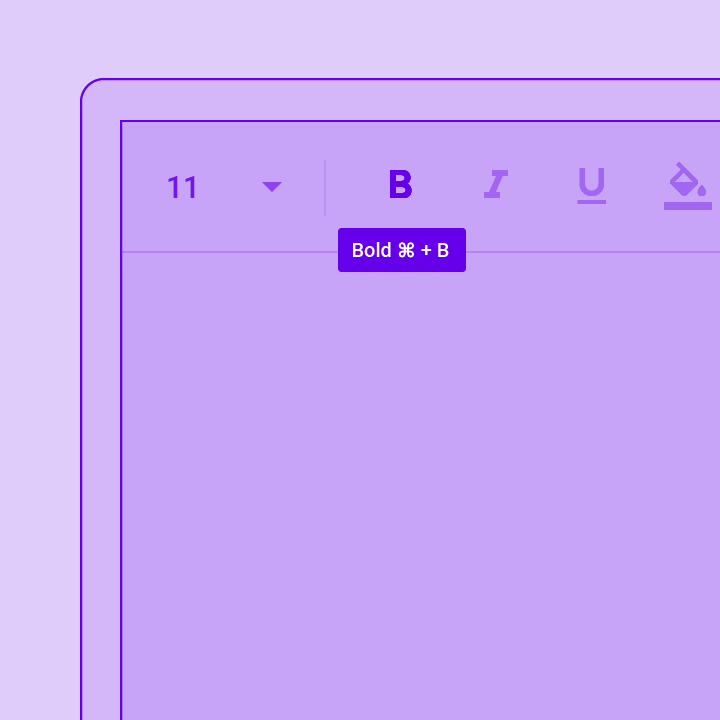
The RichText widget displays text that uses multiple different styles. The text to display is described using a tree of TextSpan objects, each of which has an associated style that is used for that subtree. The text might break across multiple lines or might all be displayed on the same line depending on the layout constraints.
A widget that rotates its child by a integral number of quarter turns.
Animates the rotation of a widget.
Layout a list of child widgets in the horizontal direction.
Implements the basic Material Design visual layout structure. This class provides APIs for showing drawers, snack bars, and bottom sheets.
Animates the scale of transformed widget.
Controls how Scrollable widgets behave in a subtree.
Scrollable implements the interaction model for a scrollable widget, including gesture recognition, but does not have an opinion about how the viewport, which actually displays the children, is constructed.
A Material Design scrollbar. A scrollbar indicates which portion of a Scrollable widget is actually visible.
A widget that annotates the widget tree with a description of the meaning of the widgets. Used by accessibility tools, search engines, and other semantic analysis software to determine the meaning of the application.
Simple dialogs can provide additional details or actions about a list item. For example they can display avatars icons clarifying subtext or orthogonal actions (such as adding an account).
A box in which a single widget can be scrolled. This widget is useful when you have a single box that will normally be entirely visible, for example a clock face in a time picker, but you need to make sure it can be scrolled if the container gets too small in one axis (the scroll direction).
Animates its own size and clips and aligns the child.
A box with a specified size. If given a child, this widget forces its child to have a specific width and/or height (assuming values are permitted by this widget's parent). If either the width or height is null, this widget will size itself to match the child's size in that dimension.
A widget that is a specific size but passes its original constraints through to its child, which will probably overflow.
Animates the position of a widget relative to its normal position.
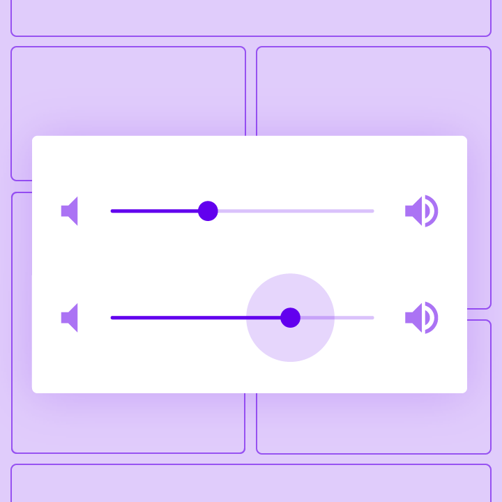
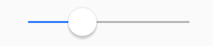
Sliders let users select from a range of values by moving the slider thumb.
A material design app bar that integrates with a CustomScrollView.
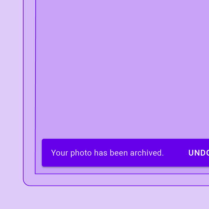
A lightweight message with an optional action which briefly displays at the bottom of the screen.
This class is useful if you want to overlap several children in a simple way, for example having some text and an image, overlaid with a gradient and a button attached to the bottom.

A Material Design stepper widget that displays progress through a sequence of steps.
Widget that builds itself based on the latest snapshot of interaction with a Stream.
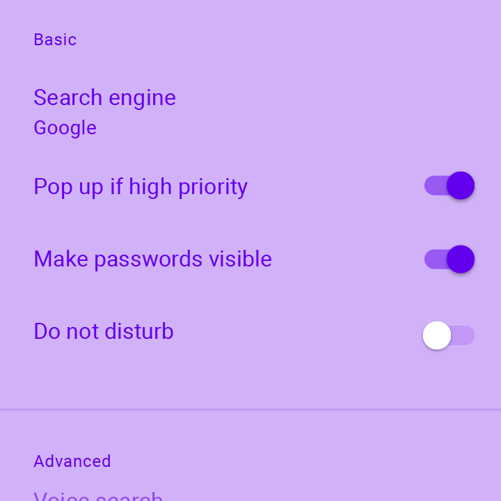
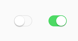
On/off switches toggle the state of a single settings option. The Switch widget implements this component.
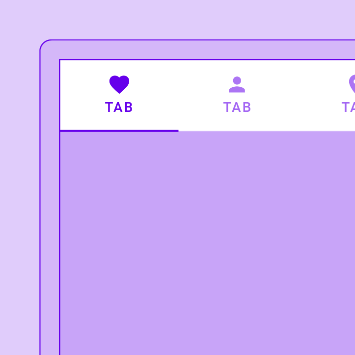
A Material Design widget that displays a horizontal row of tabs.
A page view that displays the widget which corresponds to the currently selected tab. Typically used in conjunction with a TabBar.
A widget that uses the table layout algorithm for its children.
A run of text with a single style.
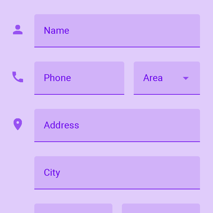
Touching a text field places the cursor and displays the keyboard. The TextField widget implements this component.
Applies a theme to descendant widgets. A theme describes the colors and typographic choices of an application.
Tooltips provide text labels that help explain the function of a button or other user interface action. Wrap the button in a Tooltip widget to show a label when the widget long pressed (or when the user takes some other appropriate action).
A widget that applies a transformation before painting its child.
A convenience class that wraps a number of widgets that are commonly required for an application.
A widget that displays its children in multiple horizontal or vertical runs.