Basic Flutter layout concepts
Welcome to the Flutter layout codelab, where you learn how to build a Flutter UI without downloading and installing Flutter or Dart!
Flutter is different from other frameworks because its UI is built in code, not (for example) in an XML file or similar. Widgets are the basic building blocks of a Flutter UI. As you progress through this codelab, you’ll learn that almost everything in Flutter is a widget. A widget is an immutable object that describes a specific part of a UI. You’ll also learn that Flutter widgets are composable, meaning, that you can combine existing widgets to make more sophisticated widgets. At the end of this codelab, you’ll get to apply what you’ve learned into building a Flutter UI that displays a business card.
Estimated time to complete this codelab: 45-60 minutes.
Row and Column classes
Row and Column are classes that contain and lay out widgets.
Widgets inside of a Row or Column are called children,
and Row and Column are referred to as parents.
Row lays out its widgets horizontally,
and Column lays out its widgets vertically.
Example: Creating a Column
Axis size and alignment
So far, the BlueBox widgets have been squished together
(either to the left or at the top of the UI Output).
You can change how the BlueBox widgets are spaced
out using the axis size and alignment properties.
mainAxisSize property
Row and Column occupy different main axes.
A Row’s main axis is horizontal,
and a Column’s main axis is vertical.
The mainAxisSize property determines how much
space a Row and Column can occupy on their main axes.
The mainAxisSize property has two possible values:
MainAxisSize.max-
RowandColumnoccupy all of the space on their main axes. If the combined width of their children is less than the total space on their main axes, their children are laid out with extra space. MainAxisSize.min-
RowandColumnonly occupy enough space on their main axes for their children. Their children are laid out without extra space and at the middle of their main axes.
Example: Modifying axis size
mainAxisAlignment property
When mainAxisSize is set to MainAxisSize.max,
Row and Column might lay out their children with extra space.
The mainAxisAlignment property determines how Row and Column
can position their children in that extra space.
mainAxisAlignment has six possible values:
MainAxisAlignment.start- Positions children near the beginning of the main axis.
(Left for
Row, top forColumn) MainAxisAlignment.end- Positions children near the end of the main axis.
(Right for
Row, bottom forColumn) MainAxisAlignment.center- Positions children at the middle of the main axis.
MainAxisAlignment.spaceBetween- Divides the extra space evenly between children.
MainAxisAlignment.spaceEvenly- Divides the extra space evenly between children and before and after the children.
MainAxisAlignment.spaceAround- Similar to
MainAxisAlignment.spaceEvenly, but reduces half of the space before the first child and after the last child to half of the width between the children.
Example: Modifying main axis alignment
crossAxisAlignment property
The crossAxisAlignment property determines
how Row and Column can position their children
on their cross axes.
A Row’s cross axis is vertical,
and a Column’s cross axis is horizontal.
Most of the crossAxisAlignment property’s values
only work with the Row class.
The crossAxisAlignment property has five possible values:
CrossAxisAlignment.start- Positions children near the top of the cross axis. (
Rowonly) CrossAxisAlignment.end- Positions children near the bottom of the cross axis. (
Rowonly) CrossAxisAlignment.center- Positions children at the middle of the cross axis. (
Rowonly) CrossAxisAlignment.stretch- Stretches children across the cross axis.
(Top-to-bottom for
Row, left-to-right forColumn) CrossAxisAlignment.baseline- Aligns children by their character baselines.
(
Textclass only, and requires that thetextBaselineproperty is set toTextBaseline.alphabetic. See the Text widget section for an example.)
Example: Modifying cross axis alignment
Flexible widget
As you’ve seen, the mainAxisAlignment and
crossAxisAlignment properties determine
how Row and Column position widgets along both axes.
Row and Column first lay out widgets of a fixed size.
Fixed size widgets are considered inflexible because
they can’t resize themselves after they’ve been laid out.
The Flexible widget wraps a widget,
so the widget becomes resizable.
When the Flexible widget wraps a widget,
the widget becomes the Flexible widget’s child
and is considered flexible.
After inflexible widgets are laid out,
the widgets are resized according to their
flex and fit properties.:
flex- Compares itself against other
flexproperties before determining what fraction of the total remaining space eachFlexiblewidget receives. fit- Determines whether a
Flexiblewidget fills all of its extra space.
Example: Changing fit properties
Example: Testing flex values
Expanded widget
Similar to Flexible, the Expanded widget can
wrap a widget and force the widget to fill extra space.
Example: Filling extra space
SizedBox widget
The SizedBox widget can be used in one of two ways when
creating exact dimensions.
When SizedBox wraps a widget, it resizes the widget
using the height and width properties.
When it doesn’t wrap a widget,
it uses the height and width properties to
create empty space.
Example: Resizing a widget
Example: Creating space
Spacer widget
Similar to SizedBox, the Spacer widget also
can create space between widgets.
Example: Creating more space
Text widget
The Text widget displays text and can be configured
for different fonts, sizes, and colors.
Example: Aligning text
Icon widget
The Icon widget displays a graphical symbol
that represents an aspect of the UI.
Flutter is preloaded with icon packages for
Material and Cupertino applications.
Example: Creating an Icon
Image widget
The Image widget displays an image.
You either can reference images using a URL,
or you can include images inside your app package.
Since DartPad can’t package an image,
the following example uses an image from the network.
Example: Displaying an image
Putting it all together
You’re almost at the end of this codelab. If you’d like to test your knowledge of the techniques that you’ve learned, why not apply those skills into building a Flutter UI that displays a business card!
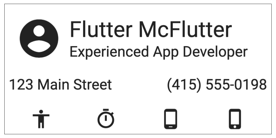
You’ll break down Flutter’s layout into parts, which is how you’d create a Flutter UI in the real world.
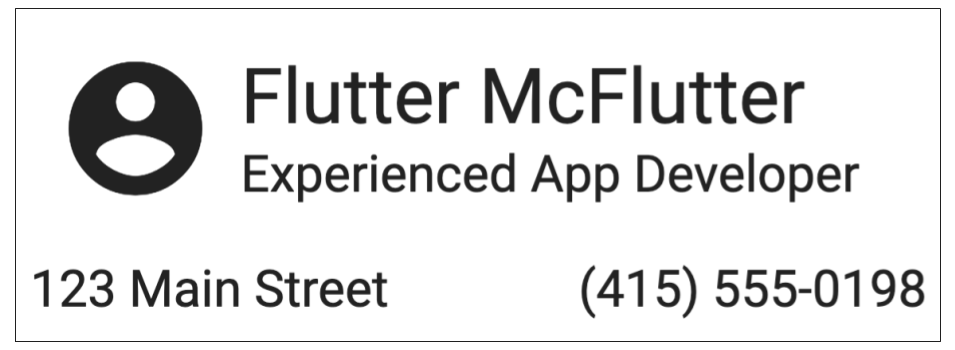
In Part 1,
you’ll implement a Column that contains the name and title.
Then you’ll wrap the Column in a Row that contains the icon,
which is positioned to the left of the name and title.

In Part 2, you’ll wrap the Row in a Column,
so the code contains a Column within a Row within a Column.
Then you’ll tweak the outermost Column’s layout,
so it looks nice.
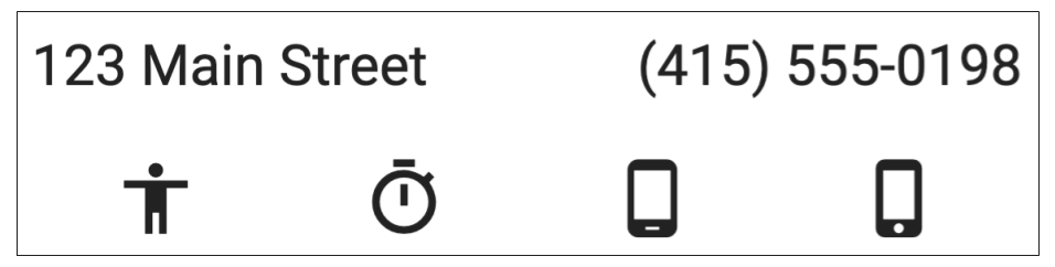
Finally, you’ll add the contact information
to the outermost Column’s list of children,
so it’s displayed below the name, title, and icon.
In Part 3, you’ll finish building the business card display by adding four more icons, which are positioned below the contact information.
Part 1
Exercise: Create the name and title
Exercise: Wrap the Column in a Row
Part 2
Exercise: Tweak the layout
Exercise: Enter contact information
Part 3
Exercise: Add four icons
What’s next?
Congratulations, you’ve finished this codelab! If you’d like to know more about Flutter, here are a few suggestions for resources worth exploring:
- Learn more about layouts in Flutter by visiting the Building layouts page.
- Check out the sample apps.
- Visit Flutter’s YouTube channel, where you can watch a variety videos from videos that focus on individual widgets to videos of developers building apps.
You can download Flutter from the install page.